Visualizations
Pyramid's data visualization engine offers users a huge range of core visualizations, as well as the ability to create custom visuals. Each core visualization can be tweaked by adjusting the chips in the drop zones. Pyramid also offers tremendous flexibility when it comes to formatting, which can be leveraged to significantly change the look and feel of each visualization.
How to Select a Visualization
New Canvas
When opening a new data discovery, the new canvas features icons representing several data visualizations. You may drag a dimension, hierarchy, or measure onto any of these icons to start building the given visualizations.

In this example, the Manufacturer hierarchy was dropped on the bar chart icon; the hierarchy was automatically added to the Categories drop zone, and once a measure was added, the bar chart was rendered.

Visualization Toolbox
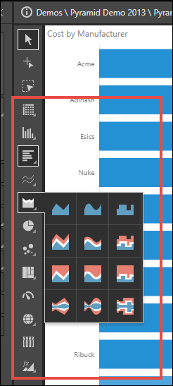
Once a dimension, hierarchy, or measure has already been added to the query, the visualization toolbox will appear on the left of the canvas (red highlight below). A visualization may be selected here by clicking on it; for instance, click the Area Chart button to create an area chart.
You may also open a sub-tool-menu for each visualization to select a related visualization. For instance, open the Area Chart sub-menu to select a Stream Spline Chart.
To open a visualization sub-tool-menu, right click on the its main visualization icon from the Visualization Menu.

Report Ribbon
You can also select a visualization from the Change Visual menu in the Report ribbon.
